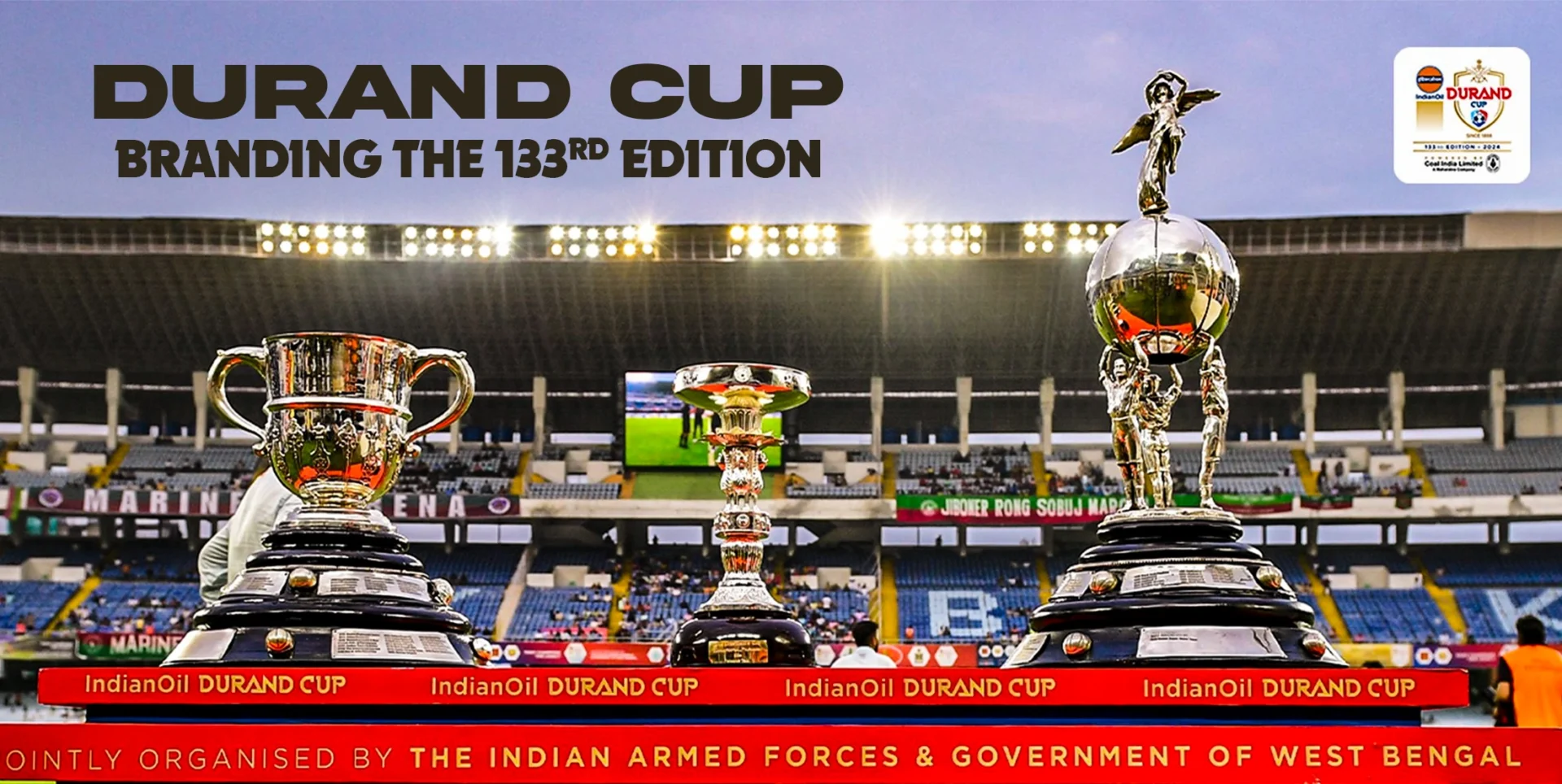
About Durand Cup:
First held in 1888, the Durand Cup is Asia’s oldest surviving football tournament and the third oldest in the world. Named after its founder, Sir Henry Mortimer Durand, who served as the Foreign Secretary of British India from 1884 to 1894, the tournament has a storied legacy. Originally conceived as an inter-departmental and inter-regimental competition for the Indian Armed Forces, it has since evolved into a prestigious football event celebrated across the region.
Objective and Campaign Brief:
Owned by the armed forces, the prestigious Durand Cup carries an unparalleled legacy steeped in history and honor. The tournament, along with its branding, marketing, and overall presentation, has consistently exuded an air of sophistication and respect. However, in today’s fast-paced, social media-driven world, its online presence required a modern revamp. The challenge lay in striking a balance—updating the tournament’s look and feel to meet contemporary standards while preserving the class and dignity befitting such a historic competition.
Our Approach:
- Vibrant Colours and Pattern – We selected four vibrant colors—Pink/Purple, Light Green, Sky Blue, and Orange/Yellow—to represent the four cities, infusing the tournament’s social media presence with brightness and a sense of freshness. To eliminate any sense of emptiness in the visuals, we designed a dynamic wavy pattern for the background. These patterns, crafted in the four distinct colors, were meticulously designed so that when combined, they seamlessly form a single, cohesive, and elegant composition, adding depth and harmony to the overall design.
- Visual Element – Our aim was to design an element that honored the pride and legacy of the Indian Army while introducing a fresh, modern aesthetic. To achieve this, we creatively merged the iconic army camouflage print with the four vibrant colors, resulting in a unique grainy pattern that served as a tribute to the soldiers. To maintain a balanced visual appeal, we restricted the use of this pattern to the borders of the social media creatives, ensuring it did not overpower the overall design. This subtle approach also symbolized the army’s quiet yet crucial role—working diligently and silently to protect and serve.