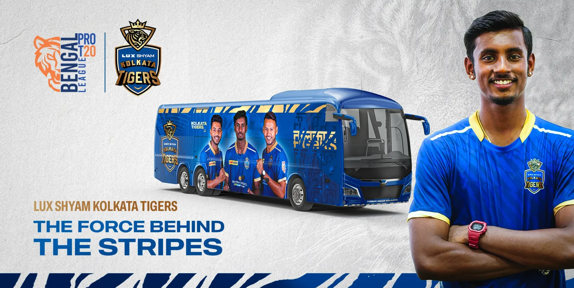
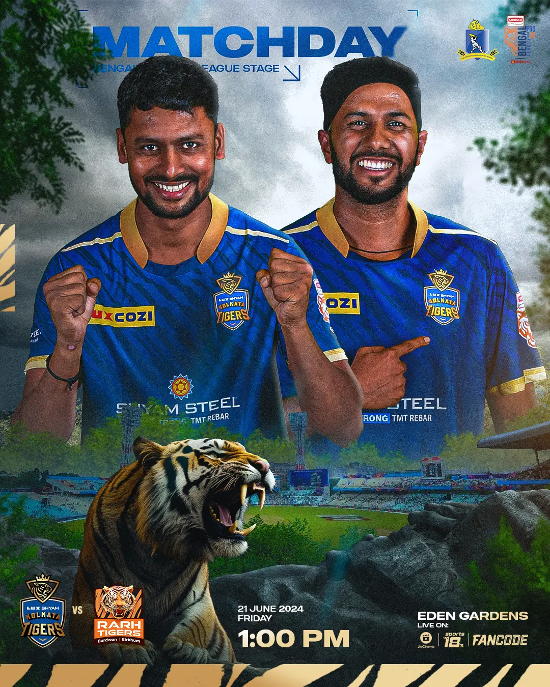
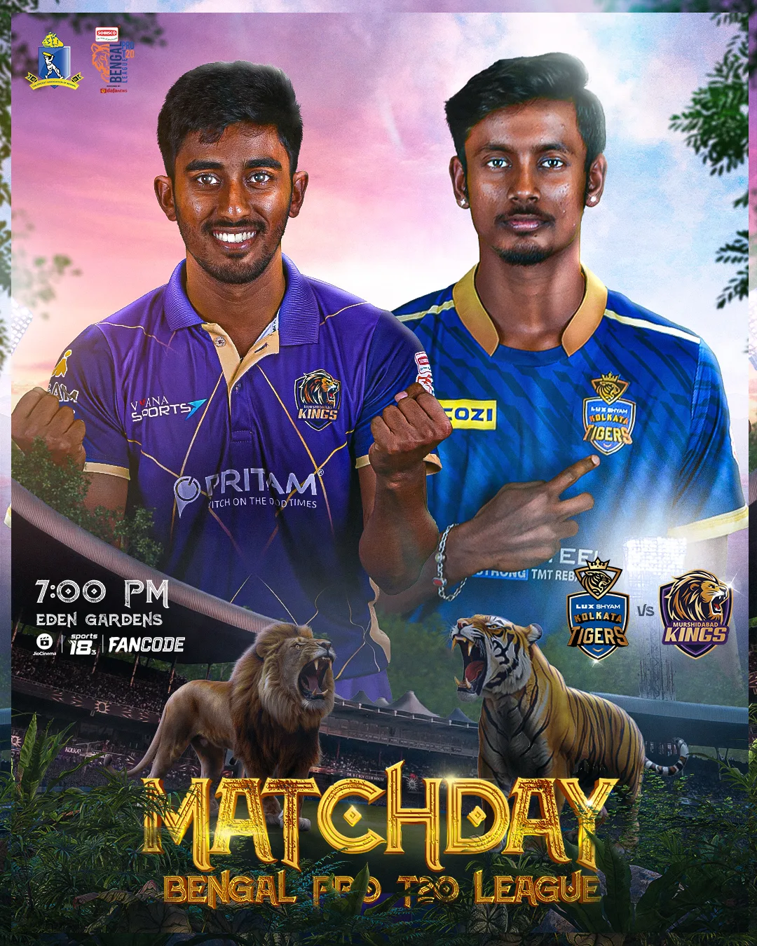
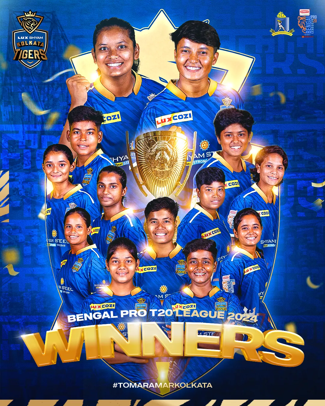
About Lux Shyam Kolkata Tigers:
The Lux Shyam Kolkata Tigers, established in 2024, are a prominent franchise in the Bengal Pro T20 League. Jointly owned by Shyam Steel and Lux Industries, the team proudly represents Kolkata district in this prestigious state-level tournament. The men’s team is captained by Abishek Porel, one of India’s most promising superstars playing for the Delhi Capitals in the IPL, while the women’s team is led by Mita Paul, one of Bengal’s most celebrated cricketers.
Objective & Campaign Brief:
When it comes to cricket in Kolkata, the Kolkata Knight Riders (KKR) naturally come to mind—a team that has become an enduring emotion for the city’s residents since the inception of the IPL. Building a unique identity for the Lux Shyam Kolkata Tigers in this cricket-loving city was, therefore, no small challenge. Our goal was to craft an identity that not only captured the vibrant spirit of Kolkata, the most dynamic city in the state, but also carved a special place in the hearts of its people. Also, we aimed to create a tagline that resonated with fans as deeply as KKR’s iconic “Ami Kolkata.”
Our Approach:
- Font Selection – We chose a thick and bold font to symbolize the strength and powerful nature of tigers. This design choice also conveyed a sense of resilience and masculinity, aligning with the image we wanted to project. Additionally, the bold font ensures high visibility and impact across various mediums, making the branding more memorable and instantly recognizable.
- Visual Element – Our goal was to design a visual element that symbolized the regal essence of the Royal Bengal Tiger while reflecting a modern, vibrant aesthetic, in line with Kolkata’s reputation as the state’s trendiest and most dynamic city. However, we took a restrained approach to incorporating this element, using it subtly as thin stripes or borders. This deliberate choice ensured that the branding retained its balance and sophistication, avoiding the common pitfall of letting tiger stripes overwhelm the identity—an issue often seen in sports brands featuring “Tiger” in their name or imagery.
- Typography Element – A similar thought process guided our choice of typography. We aimed for a modern and stylish representation of the Kolkata Tigers that would resonate with the youth. Given the significant participation of young talent in the Bengal Pro T20 League, it was essential to incorporate a typographical design that captured the league’s vibrancy. To achieve this, we wrote “Kolkata” in Bengali, paying homage to the region’s cultural roots, while opting for a mix of English uppercase and lowercase letters for “Tigers,” adding a contemporary and dynamic touch to the overall design.
- Pattern Element – The pattern element was designed to add a creative flair to the instant graphics produced during games using raw images from broadcasters. Rather than simply adjusting the image colors, we aimed to infuse a sense of artistry, reflecting Kolkata’s rich cultural and artistic heritage. To achieve this, we developed a striking, symmetrical pattern inspired by the crest border of the Kolkata Tigers logo, creating a bold, dynamic backdrop that elevates the visual appeal of game-time graphics.
- Background – Our vision was to feature the Royal Bengal Tiger in the background, but we wanted to ensure it complemented, rather than overshadowed, the modern elements in the graphics. The goal was to portray the tiger in a way that balanced aggression with sophistication. We achieved this by blending the tiger seamlessly into a blue background, highlighting its eyes and teeth in gold. This combination added a striking aesthetic value, making the design both impactful and elegant.
Tagline Ideation: Tomar Amar Kolkata
The task at hand was undeniably challenging, given that KKR’s iconic tagline, Ami Kolkata, is deeply ingrained in the hearts of the city’s residents. However, we recognized that the people of Kolkata are profoundly emotional and form strong, enduring connections with what they admire and love. With this insight, we focused on creating a tagline that embodies a unified Kolkata, fostering a sense of belonging and making the audience feel an intrinsic connection to the team. This approach was also a strategic step toward building a long-term, loyal community. Additionally, the tagline’s rhyming and hummable quality enhances its appeal, making it both memorable and widely embraced.