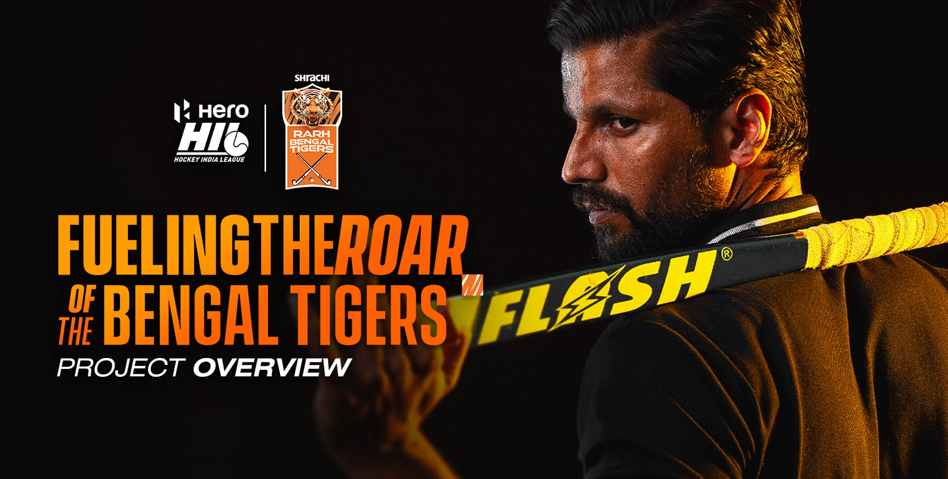

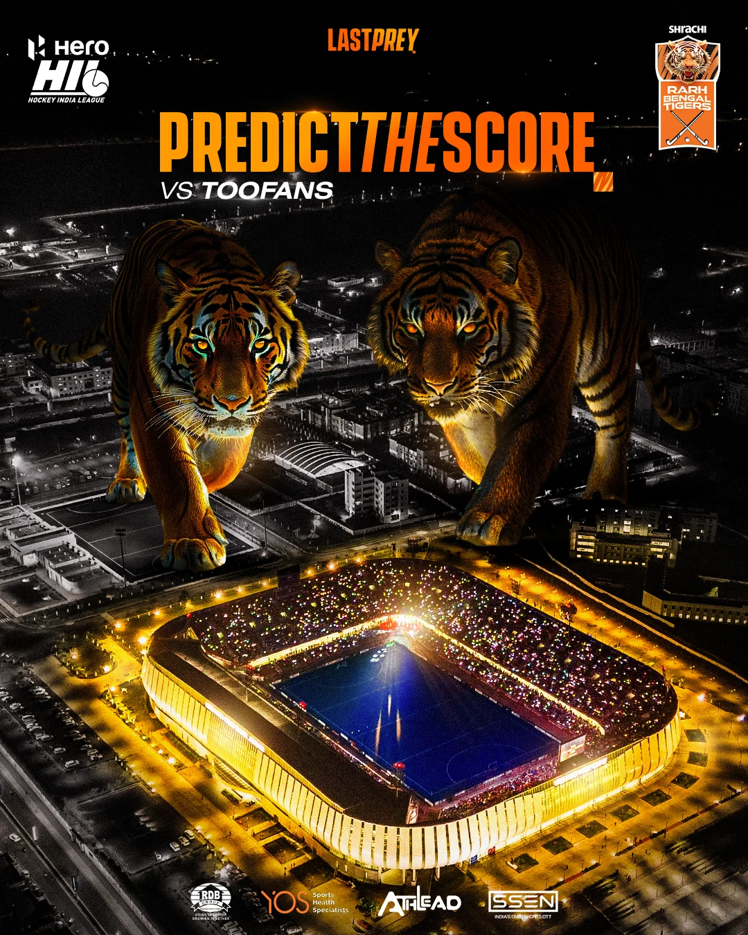
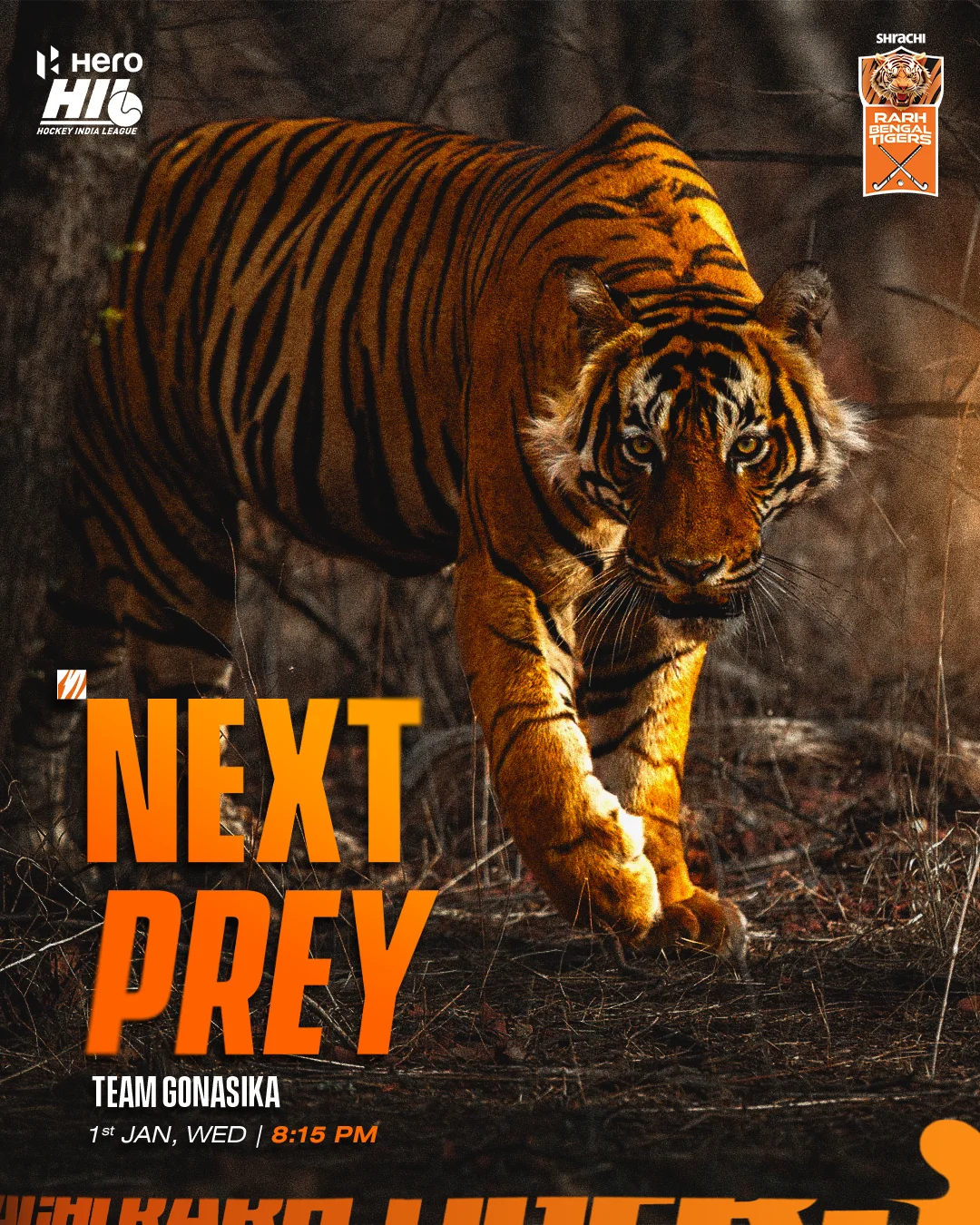

With the Hockey India League returning after seven years and Bengal making its debut, we knew we had to create something bold that made a statement. For the Shrachi Rarh Bengal Tigers, we wanted the branding to reflect the team’s fearless and dominant spirit. Inspired by the power of a tiger, we used dynamic stripes and strong typography to capture their energy and aggression. The goal was to ensure the Tigers stood out as a force to be reckoned with, making a powerful impact in their first season.
We created this brand element for the Shrachi Rarh Bengal Tigers to complement our typography. The stripes, an iconic feature of tigers, were seamlessly integrated into the team’s identity to enhance its relatability to the team name. These dynamic tiger stripes serve as a versatile graphic tool, designed in various versions to suit a wide range of creative applications.
The second brand element merges the essence of the sport with the team’s identity. We combined the most crucial tool in hockey—the stick—with the team name, “Shrachi Rarh Tigers.” This creative integration shapes the name into the form of a hockey stick, delivering a striking visual cue that instantly connects with the sport and the team.
To match the aggressive brand voice of our team, we selected fonts that exude power and masculinity. A strong, tall typeface paired with a bold, wide one ensures the team’s name carries the weight of its legacy and reputation with confidence and pride.
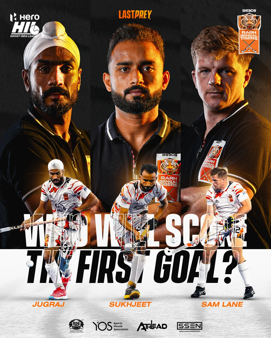
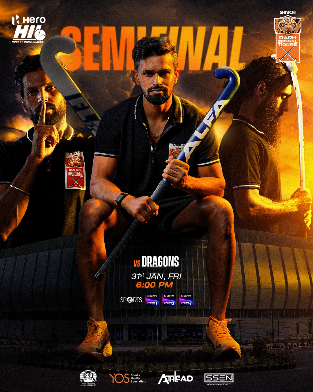
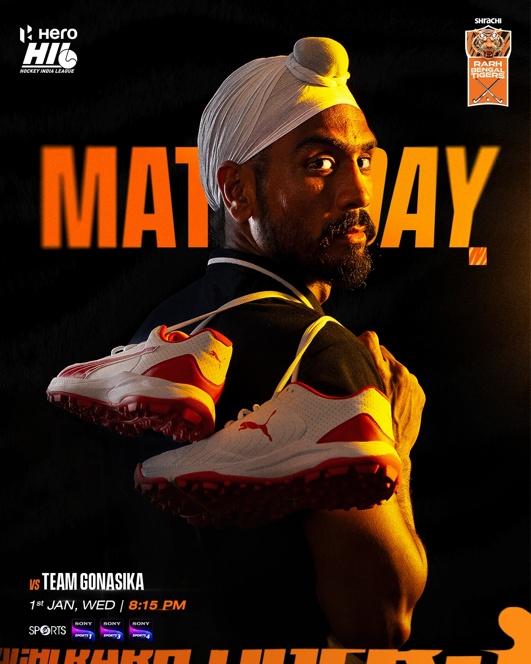
The theme of the season photoshoot was designed to reflect the team’s bold and fierce identity. Breaking away from conventional smiling portraits, we opted for intense, focused expressions that radiate power and determination. The setup featured an all-black backdrop to amplify the sense of seriousness and a battle-ready attitude. Dramatic orange lighting from one side added a fiery contrast, symbolizing the team’s energy and passion, while highlighting the sharp details of the players’ features. Close-up shots were prioritized to capture the grit, attitude, and raw emotion of each player, making the visuals both striking and unforgettable. This meticulous approach ensured that every frame echoed the team’s aggressive mantra and unwavering spirit.